How To # 9: Causal Inference Methods-DeepIV against Causal ForestDML

“Art is not what you see, but what you make others see.”- Edgar Degas
Everyone can copy and paste some generic code but few know what to truly do with the results of the code. In the real world most datasets are not normalized and there isn’t always a positive correlation with data that fits distributions. Using someone’s code isn’t horrible but due some due diligence and learn how to actually use it.
Professionally I am a data scientist. I’m working on causal inference examples for our data science team built off of analyzing training taken by users and their pre and post training scores. As said above there isn’t a positive correlation and that is fine: but what will we do with that information? It doesn’t stop at spitting out numbers. We have to prove it to a reasonable statistically sound degree. Here I will show some examples of what I have used with a perfect distribution but delve deeper into what the results mean instead of regurgitating code as most tutorials do.
I first analyzed with DoWhy to see what estimand I would need (past post). Estimator reccomended instrument variable but I needed to know what the treatment effect was for each user. I found the below model that uses two neural networks, one for the treatment and one for the outcome.
This data was random and normalized so should work at each stage. Using this as more of a pipeline for possible analysis.
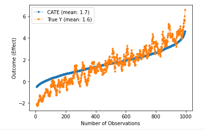
We can see that the conditional average treatment closely fits the train dataset. What this can be used for is future predictions as long as the confounders are fit with the training. The double neural networks fit the data well and discover the causal effect well.
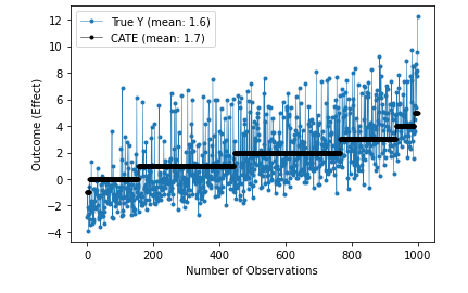
When analyzing the summary for both the OrthogonalForest algorithm and the CausalForestDML algorithm its evident that the distributions are fairly tight. The ‘point_estimate’ is the ATE or ATT depending on where it is getting read. The ‘ci_lower’ and ‘ci_upper’ are the confidence intervals for each treatment affect. These are stored as their own arrays for easier visualization as seen below.


After the models learn the causal effect of the treatment on the outcome along with the confounders and controls, new predictions can be made with new controls. The way to look at these charts is to think of the ‘x’ array as different possible controls be they floats or ints. The treatment on the vertical axis is the possible treatment effect that would be given to each specific control. The treatment effect is the average of the possible effects on the outcome having taken ‘treatment’ or not. This can also be visualized with the following charts with fewer different controls. Above controls were from 0–1 and bottom is 0–5. There is a separate treatment for each control entry.

https://github.com/adavis-85/Deep-IV-and-CausalForestDML-Example-Notebook