How to #10: What To Do With Average Treatment Effects and Data

“A good impression is lost so quickly.” — Monet
In #9 of this How To series I showed how to find the average treatment effect of an intervention on subjects. What to do with that data? How would we segment our groups in order to study who would be affected the most from said intervention? Let’s explore.
On the tail end of our analysis we have the upper and lower bound of each treatment effect:

How could these treatment effects be best grouped? We’ll test out Kmeans and Harabasz-Calinski clustering.
We have the original dataset concatenated to the ATE. The elbow test over time has been proven to not always work. That’s where Harabasz-Calinski comes in. We have a score per grouping and basically pick the greatest score and that is the amount of groups that we have. For our data we have the following chart:

We see that we have the highest score at two clusters. The chart is similar to what one would see for a standard Kmeans with elbow included. This chart also tracks according to our ATE as is is non-linear and is almost appearing as an exponential function. Let’s visualize the two clusters on our ATE vs. our data:
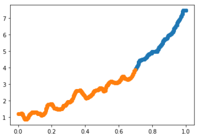
We can see that there is a defined grouping. It appears that the slope changes for the blue cluster. Let’s take a look at another parameter:
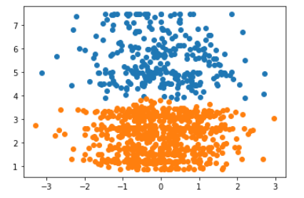
Still a clear division.
The last step would be to do some data analysis on these defined groups and see where and why they differ. The ultimate goal is to provide valuable insights and take the analysis a step beyond simply saying that the intervention has a causal effect or not.